McKee is one of the most famous and prolific artists for skateboard graphics. Often ironic, fun and sometimes shocking, his style is unmistakable. His presence in the skateboarding draws its roots in the early nineties and it’s strongly connected to the name World Industries. His graphics set a milestone in the visual world of skateboarding. With these questions we try to find out how Marc got to Milano and designed his first graphic for a bastard snowboard… and for a limited edition Blind skateboard.
How did you start drawing? Were you always interested in drawing and/or designing graphics?
Yeah, ever since I was young. It started with drawing dinosaurs and stuff from Star Wars. Then later when I was in middle school and high school I would copy the art from Heavy Metal records and the Pushead drawings in Thrasher.
How did you start working in the skateboard industry?
In 1988-89 I did graphics for a BMX bike company called Bully that was owned by R.L. Osborn, who was a pro freestyle rider at that time. Coincidentally Steve Rocco and Rodney Mullen were his roommates at his house in LA. Rocco saw some of the T-shirt graphics I did for Bully and asked me to start doing graphics for World Industries.
You worked side to side with Steve Rocco in the early 90s, in such an important moment in skateboarding’s history, did that leave a mark on you?
Yeah. From the start of the company Rocco’s approach was always to do whatever he wanted without caring about what other people thought. It was a great environment for making art because of the total freedom from limitations.
What’s changed between then and now? Is your job any different nowadays, and if so, how?
Unfortunately there is less involvement from the riders in coming up with their graphics. I need to try reaching out to them more. Also Rocco has long since retired and there will probably never be another company owner like him who just doesn’t give a fuck about anything like he did. Even after running World for a few years things changed and he shifted the focus of the company from total anarchy to more of a legitimate business. So even if he came back things would not be the same….
Best funny story in your whole career?
Probably being locked in Disneyland jail with Danny Way, Lance Conklin and Jeff Tremaine. We were there because Lance was being arrested for jumping off the Monorail platform into the Submarine Ride. I filmed it for Big Brother magazine and it was also in the first Big Brother video. It was a crazy day. The reason we were there was to interview the band Slayer. Somehow Kosick convinced their publicist to get a limo to bring them to Disneyland and get drunk with us in the hotel bar and then ride the rides together. A lot of the people that worked on Big Brother magazine back then like Tremaine and Kosick, (and Cliver, Wee Man, and Pontius, who were also there that day) went on later to create Jackass.
What kind of relationship develops between you and the pros you design the graphics for?
Hopefully a good one. The best graphics are when you get input from the riders, and then you come up with something that matches their personality. Like with Mike Vallely a lot of the graphics he had on World came from him being a vegan and involved animals as symbols of strength and survival. In that way it’s good to have a consistent theme or image for the riders, even though sometimes they might see it as typecasting them too much. Like with James Craig on Blind it might seem like his whole life is just watching the Lakers and drinking Coronas. The funny thing is that’s who he really is! (haha).
Who’s been the most demanding pro you’ve ever worked with?
Maybe Jason Dill? Only because the few graphics I did for him when he was on 101 were things he wanted that were basically just copied from other artists like Mucha or the guy who illustrated Winnie the Pooh. They weren’t quite the same as the rip-off graphics we were known for back then where we would change the characters or logos in some way that made fun of things.
What are the steps you take for creating a new graphic and for finalizing an idea?
Usually I start with an idea first and just try to picture it in my mind to decide if it will work or not. Then sketch it really roughly in pencil, sometimes from different angles or with the figures in different positions. Like with the James Craig Lakers board I tried drawing it as a vertical graphic before changing it to be horizontal. I almost always feel like the process is way too complicated and takes too long.
How many deck graphics have you designed in your career? Do you physically hold to every board you design?
Probably over 1000. I used to keep one of each board but I stopped doing that about 5 years ago. I still have one of each of almost all the really early graphics though from the 90s.
What’s the best offer you’ve received for a vintage board that you own or for one of your original designs?
A few years ago someone offered $2000.00 for the 101 Eric Koston Buddha deck. The most I’ve seen someone else sell one for on Ebay was over $5K for the Natas Devil Worship board. So far though I haven’t sold any of the boards from my own collection, and they’re just sitting in boxes, which seems kind of like a waste-haha. I keep going back and forth on if it would be better to keep everything together, or if I should start selling them.
Name your 5 favorite graphics of all times and why do you like them so much.
The number one has to be the Ray Rodriguez Skull and Sword for Powell by V. C. Johnson. It pretty much forever established the skull as the main symbol for skateboarding. And the angle of how the skull is drawn where you’re looking up at it from below is totally awesome.
Number two is the Rob Roskopp series from Santa Cruz by Jim Phillips of the arm breaking through the target. That was great how it created a progression over 5 different boards where you would see more and more of the arm of the monster breaking through each time. Then the Dogtown Cross by Wes Humpston and the Dead KKK guy for Real by Natas and Jim Thiebaud. The Dogtown cross was great how it had the look of gang graffiti. It totally captures how skaters are outlaws, which is true to this day since street skating is still illegal in most places. Of the ones I’ve done the Natas devil is probably my favorite. A big part of that is because Natas was one of my favorite skaters and how he offered to use the graphic when it got turned down by Jason Lee, who it was for originally. That was really cool, especially since he didn’t mind how it played on how everyone used to make a big deal of how his name was “Satan” spelled backwards.
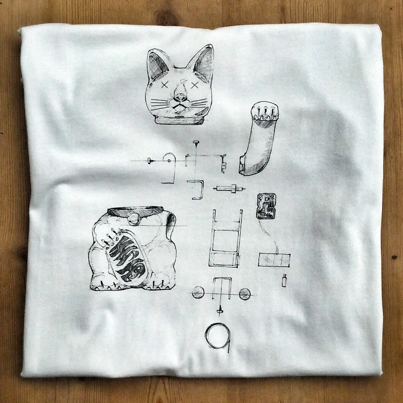
How did you start collaborating with bastard?
Last year I came out with a book of my art, and in April bastard put on an art show and book release party in their design office in Milano. After that we talked about doing a collab which ended up being T-shirt, snowboard and skate deck combo that would be with Blind Skateboards. The idea was to do something that had the controversial subject matter of some of the old Blind graphics and that was also related to Italy.
A pope with devil’s horns, how did such an idea cross your mind?
The original idea came from Claudio! [NdR: who obviously stole it from GroS!] It was to show the Pope from behind and have the lower half of his body with goat legs and feet, and a devil tail. He was going to be standing on the balcony above St. Peter’s square, so the people below would only see the top half of his body. I sketched it out that way first, but it turned out better to just show him from the front lifting his hat to show the horns. It’s basically the same idea.